
Step 1: Choose the right tablet and stylus for your design workflow. Consider iPad Pro with Apple Pencil, Wacom Cintiq, or pen displays from Huion and XP-Pen. Evaluate color accuracy, pressure sensitivity, tilt support, latency, and screen size. Prioritize devices that match software choices and budget.
Step 2: Set up essential apps, updates, and custom brushes before sketching. Choose from Procreate, Adobe Fresco, Photoshop, Affinity Designer, or Clip Studio based on features. Configure canvas sizes appropriate for final output to avoid resampling artifacts.
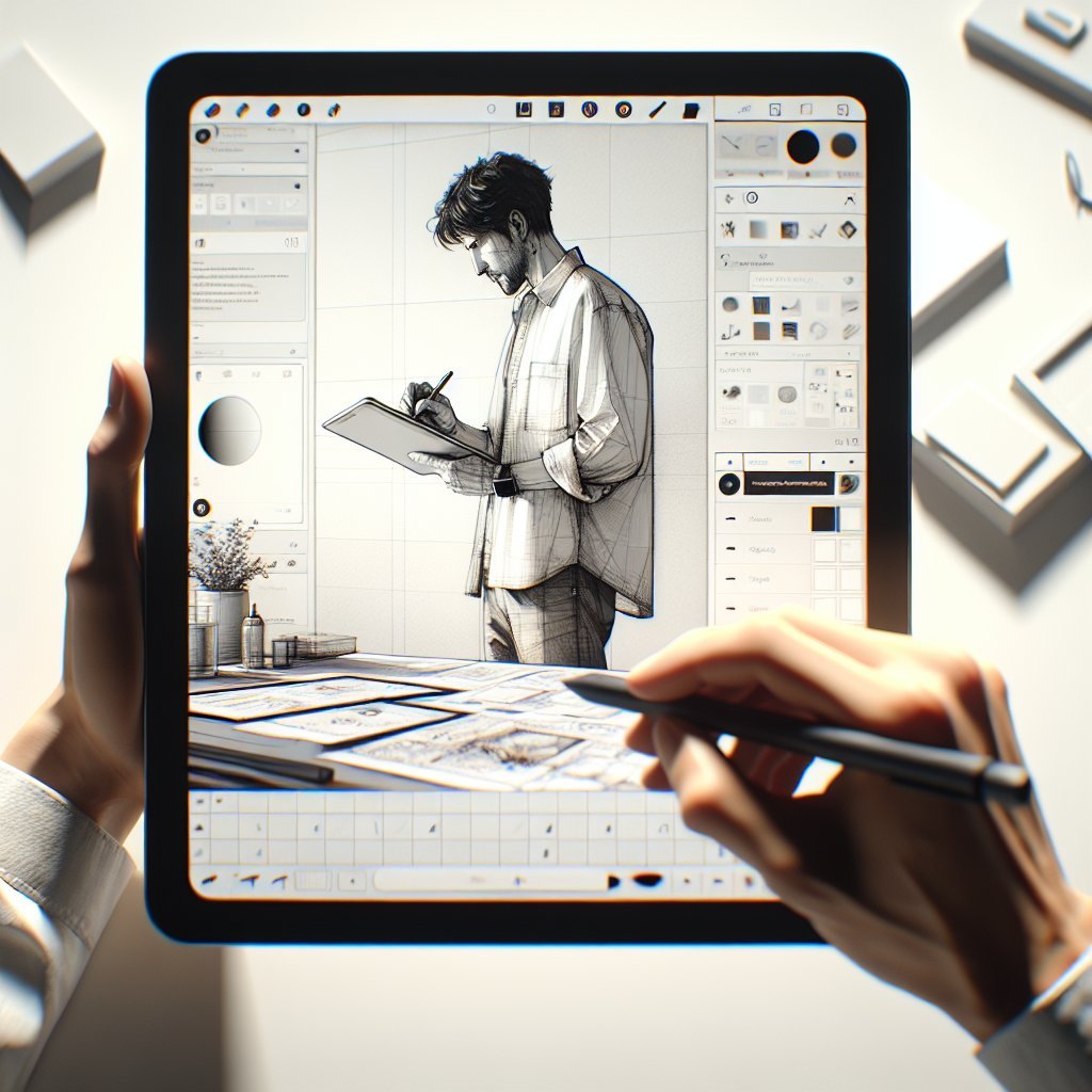
Step 3: Create a reproducible workspace layout with layers, reference boards, and quick menus. Name layers like Thumbnails, Construction, Linework, Values, and Color to speed navigation. Save a template file so you can start each project with consistent settings.
Step 4: Rapid thumbnailing—generate many quick compositions to test silhouettes and focal points. Spend ten to twenty minutes making eight to twelve thumbnails and pick the strongest idea.
Step 5: Construct forms using simple shapes and perspective lines. Build volumes from spheres, cylinders, and boxes; mark vanishing points and horizon line early. Use low opacity strokes for construction and switch to higher contrast when refining.
Step 6: Develop confident linework; leverage pressure to vary weight and suggest depth. Use vector layers or stabilization if you need ultra-clean edges.
Step 7: Block values before adding color to ensure readability and form. Work with a limited three value plan—dark, mid, light—then refine gradients and local contrasts.
Step 8: Select a harmonious palette and save swatches for consistent color use. Experiment with complementary accents and temperature shifts to create depth.
Step 9: Introduce texture selectively with brushes and overlays to avoid visual noise. Use multiply and overlay modes for shadows and highlights and clipping masks for clean edits.
Step 10: Add focal details last; sharpen small elements to guide the viewer’s eye. Avoid cluttering midground values with unnecessary patterns that compete with focal areas.
Step 11: Iterate, export versions, and request feedback from peers or clients. Export layered PSDs for collaborators and flattened PNGs for quick previews; include color profile metadata.
Step 12: Optimize speed with custom shortcuts, hardware buttons, and timeboxed practice sessions. Practice three thirty-minute sprints per week focused on gestures, perspective, and anatomy to build muscle memory.
Common mistakes include skipping thumbnails, poor layer naming, and overusing smoothing or auto-stabilizers. Also avoid neglecting device calibration and delivering files without clear naming or color profiles.
Pro tips: build modular brush sets, save export presets, and create a starter template for common deliverables. Use soft light for color harmonization and a grain overlay at low opacity to simulate analog texture.
Resources: follow app tutorials, join design forums, study master sketches, and take targeted courses on gesture, perspective, and color.
Delivery checklist: confirm resolution and color profile, include layered and flattened files, add usage notes, and back up everything.
Brush settings and customization are powerful for replicating traditional media and speeding up tasks. Adjust jitter, spacing, flow, and opacity dynamics to control stroke texture; map pressure to size and opacity for expressive lines. Save multiple variants and document intended uses—one for fast sketching, one for tight line art, one for textured fills.
Master gestures and multi-touch shortcuts to avoid breaking flow. Learn undo gestures, quick color pick, and canvas rotation to speed revisions.
Troubleshooting common hardware issues: recalibrate pen input, update drivers, reset Bluetooth pairing, and check for firmware updates. If latency or lag appears, reduce canvas size, lower brush smoothing, or close background apps consuming CPU.
Use PSD for layered exchange, TIFF for lossless raster, and PNG for web previews. Export vectors as SVG or PDF when shapes must scale.
During collaboration, include color swatches, font recommendations, and export scale guides. Provide layered files and flattened art with clear naming conventions.
Maintain ergonomic posture: tilt the tablet correctly, take microbreaks, and adjust stylus grip. Eye strain reduces with proper screen brightness and warm light in the room.
Document process steps in your portfolio: thumbnails, construction, and final files show problem solving and value decisions. Include notes about tools and export settings to help clients understand deliverables and reproduce look across platforms.
Create a progressive practice plan: week one focuses on gestures and silhouettes, week two on perspective and construction, week three on lighting and color. Keep a daily sketch log and review improvements monthly to identify recurring weaknesses and measure progress.
Offer layered sources and asset packs as premium upgrades. Clearly state licensing terms and allowed usages in client agreements.
Regularly back up your brush libraries and templates to cloud storage and external drives to prevent data loss. Label exports with project name, client, date, and version number to streamline asset management.
Understand device color profiles; proof images in both sRGB for web and CMYK for print when applicable to avoid surprises. When collaborating with developers, provide asset scales such as @1x, @2x, and @3x exported tiles and specify safe areas. Use naming conventions for layers like BG, MID, FG, UI, and LABEL to make handoffs predictable. Automate repetitive exports with scripts or actions inside your chosen app to save time on delivery.
Solicit critique from multiple sources; interpret feedback through the lens of your design goals and client brief. Prioritize fixes that improve silhouette, value contrast, and focal clarity before adjusting micro details. Allocate time in your schedule for style experiments to prevent creative stagnation and expand your visual vocabulary.
Final file hygiene includes embedding fonts when exporting PDFs, flattening spot effects for print, and delivering swatches along with exported files. Maintain device firmware and app updates to benefit from performance optimizations. Consider a textured screen protector for tactile feedback that mimics paper.
Measure efficiency improvements by timing project stages: brainstorming, thumbnailing, construction, and finalization. Track how much time each step consumes and set realistic reduction goals. Use constraints like limited palette, single light source, or reduced brush set to force design decisions and increase clarity. Constraints accelerate iteration and teach decisive problem solving.
Update your portfolio quarterly with fresh tablet sketches and annotate process steps and software used.