
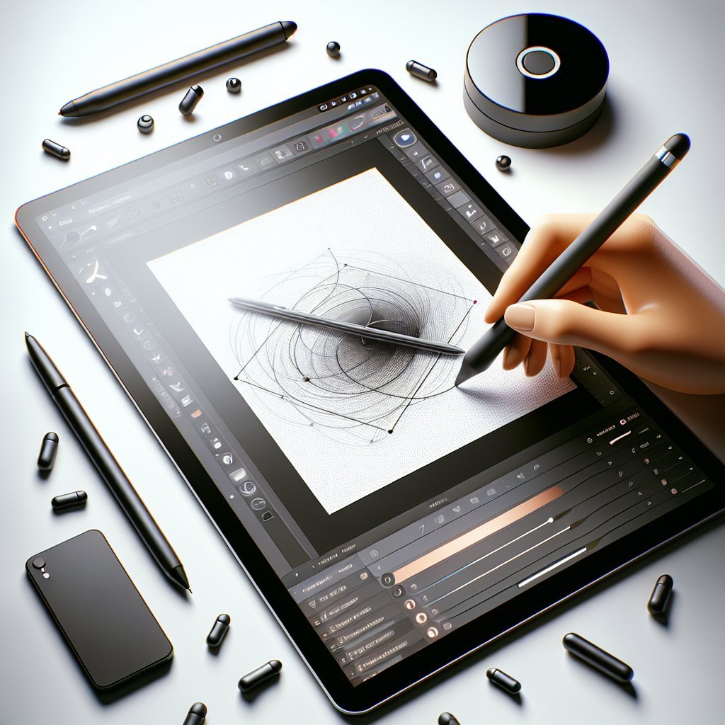
Device selection matters: choose a tablet that balances screen size, color accuracy, pressure sensitivity, and performance. Popular choices include iPad Pro with Apple Pencil, Wacom Intuos Pro, and Samsung Galaxy Tab S series with S Pen. Consider display type (OLED vs IPS), resolution, and latency; creative professionals prioritize low latency and high color gamut (sRGB or DCI-P3). Storage and battery life affect workflow; cloud syncing and external storage options are helpful. Stylus features like tilt, programmable buttons, and palm rejection improve precision. Budget alternatives exist, but prioritize reliable drivers and software compatibility to avoid interruptions during detailed illustration sessions always.
Selecting illustration software hinges on goals: raster programs like Procreate, Photoshop, and Krita excel for painterly texture and brush customization; vector tools like Adobe Illustrator and Affinity Designer are ideal for scalable graphics and clean linework. Evaluate layer systems, nondestructive editing, mask support, blend modes, and custom brush engines. Performance on your tablet matters—look for GPU acceleration and low memory footprint. App ecosystems and plugin support expand functionality: brushes, pattern packs, and texture overlays. Trial versions help assess workflow fit. Beginners appreciate simpler interfaces; advanced artists need scripting, batch export, and color management to ensure professional deliverables and collaboration features too.
Optimize your workspace: create an ergonomic drawing station with a comfortable chair, adjustable stand, and anti-glare screen protector. Set pen pressure curves and shortcut keys to reduce strain. Configure file settings before starting: choose appropriate canvas size, resolution (300 dpi for print, 150–300 dpi for detailed web illustrations), and color profile (sRGB for web, Adobe RGB or DCI-P3 for print and high-end displays). Use non-destructive layers, named groups, and consistent naming conventions for assets. Save versions with timestamps or incremental filenames and enable automatic backups or cloud saves to protect work from crashes and accidental overwrites during long illustration sessions.
Plan compositions with thumbnails and reference boards. Start with quick thumbnail sketches to explore silhouettes, focal points, and visual flow—iterate 6–12 variations to discover the strongest layout. Gather photo references, color palettes, and texture samples; use mood boards to maintain stylistic consistency. Apply the rule of thirds, golden ratio, and leading lines to guide viewer attention. Consider negative space and value contrast by squinting at thumbnails or using desaturation tools to evaluate shapes independently from color. Lock working proportions early to avoid reworking; create a rough value pass to confirm composition before committing to detailed rendering and color choices now.
Block forms using broad, hard-edged brushes to establish major shapes and values. Avoid details at this stage; prioritize readable silhouettes and weight distribution. Transition to refined sketching by tightening line quality, experimenting with brush opacity and smoothing options to achieve steady strokes. For clean line art, use vector stabilization or software stroke smoothing, and draw confidently with longer strokes instead of short choppy marks. Vary line weight to imply depth—thicker lines in foreground elements, thinner lines for background details. Keep a separate line layer above color layers to preserve editability, and lock transparency when shading within defined shapes for precision.
Apply color theory deliberately: pick a palette that supports mood, contrast, and readability. Start with a limited base palette and expand with accent hues for focal areas. Use color blocking to separate planes—foreground, midground, background—and test harmony using complementary, analogous, or triadic schemes. Establish light source(s) early and choose warm or cool lighting to set atmosphere. Paint base colors on separate clipped layers, then push values for highlights and shadows. Use overlays and multiply layers sparingly to add depth without muddying colors. Periodically step back, desaturate, or invert colors to spot balance issues and unintended clashes for improved overall cohesion.
Render with intention: prioritize key focal areas and simplify peripheral details to guide viewer attention. Use a variety of textured brushes to suggest surface qualities—skin, fabric, metal—without overworking every pixel. Blend selectively; maintain hard edges where planes meet and soften transitions for atmospheric depth. Employ glazing techniques with low-opacity brushes to build rich color and light. Add micro-details like scratches, pores, and specular highlights sparingly to avoid visual clutter. Use depth of field and atmospheric perspective (desaturating and lightening distant objects) to reinforce space. Frequently toggle visibility of layers to test readability and remove unnecessary complexity for cleaner final results.
Improve efficiency with custom shortcuts, gesture controls, and reusable asset libraries. Map frequently used tools to hardware buttons or on-screen quickbars. Build brush sets and stamp assets for recurring elements like foliage and texture. Use actions, macros, or batch scripts to automate repetitive tasks such as resizing and exporting. Organize swatches and brushes by project to keep consistency. Set export presets for common dimensions and file types (PNG, TIFF, PSD). Enable layered exports when needed and web-optimized exports for online delivery. Periodically clean unused layers and merge completed groups to keep files responsive and reduce load times during heavy work.
Solicit feedback and iterate to refine composition, color, and storytelling. Implement targeted revisions: adjust contrast, refine anatomy, correct perspective, and strengthen silhouettes. Use color correction tools, curves, and selective color adjustments to unify the palette and fix shifts between devices. Perform proofing for print by soft-proofing using CMYK profiles and printing test swatches. Embed metadata and proper copyright notices in exported files. Export multiple sizes for web and social media, optimize file compression to balance quality and load speed, and prepare layered source files for clients. Add descriptive filenames and alt text to improve discoverability and SEO for portfolio images.
Develop a consistent practice: schedule daily or weekly sketching to improve speed, observation, and stylization. Study foundational subjects—gesture, anatomy, perspective, lighting—and reverse-engineer favorite artists’ work ethically. Use curated online courses, tutorials, and community critiques to accelerate learning; platforms like Behance, ArtStation, and Dribbble offer exposure and inspiration. Participate in drawing challenges and timed studies to build stamina and decision-making. Document process videos and time-lapses for social sharing—these boost engagement and SEO potential when paired with descriptive captions and tags. Maintain a portfolio site optimized with keywords like digital illustration, tablet art, and illustration workflow to attract clients and employers globally.